


PROJECT DESCRIPTION
Challenge
Design a mobile app that empowers Best Buy employees to connect with each other for streamlined communication, facilitates clear and concise question-asking, and provides support both in and out of work.
Opportunity
Revolutionize the employee experience by fostering a sense of community, collaboration, and shared knowledge while offering personalized tools for professional and personal growth.
Process
Research & Planning
Conducted interviews and surveys with Best Buy employees to understand their communication challenges and support needs. Identified pain points, including unclear question-asking processes and lack of community engagement.
Design & Prototyping
Collaborated with designers to create wireframes and interactive prototypes. Iteratively refined the app’s design based on usability testing with employees, focusing on clear communication flows, intuitive navigation, and features that foster connectivity and support.
Development & Implementation
Utilized agile methodologies to build the app from scratch. Prioritized the development of core features, such as real-time Q&A forums, group chats, and store announcements.
Testing & Optimization
Conducted user testing with employees and user group participants. Gathered user feedback through beta testing and iteratively optimized the app based on usability metrics and user satisfaction.
Understanding the Space
A competitive analysis looking at how other online platforms handle communication within a workplace. The competitive analysis introduced us to online communication platforms within a workplace. The analysis informed us of key in-app features employees have available.
Understanding the User
Interviews were conducted with 8 Best Buy employees and other retail workers. The goal of these interviews was to understand how employees currently communicate, and to find pain points within employee communication.
"Best buy employees currently communicate on a big group chat. I like using the walkie talkies on a slow day, but on busy days, they use voice messages to find people/do tasks.”
“I also use personal phones at work finding an item in the store and using the flash feature to find it."
Creating for the User
After understanding the pain points that retail employees are currently facing, we decided to bring the ideas that were inspired by our competitive analysis to reality by engaging in some early sketching of the Profile Page, the Forum Page, and an iteration of a Profile Page.


RESEARCH
The Space
A competitive analysis was conducted to explore what platforms retail employees are currently using to get a better understanding of how these platforms build and maintain their sense of community.
The research phase provided us with valuable insights into the market, competitors, and users, which served as a foundation for the design process.
After conducting a thorough competitive analysis, our team shifted our focus towards understanding the user flow. The competitive analysis provided us with valuable insights into our competitors' strengths and weaknesses, allowing us to identify opportunities for improvement and differentiation.
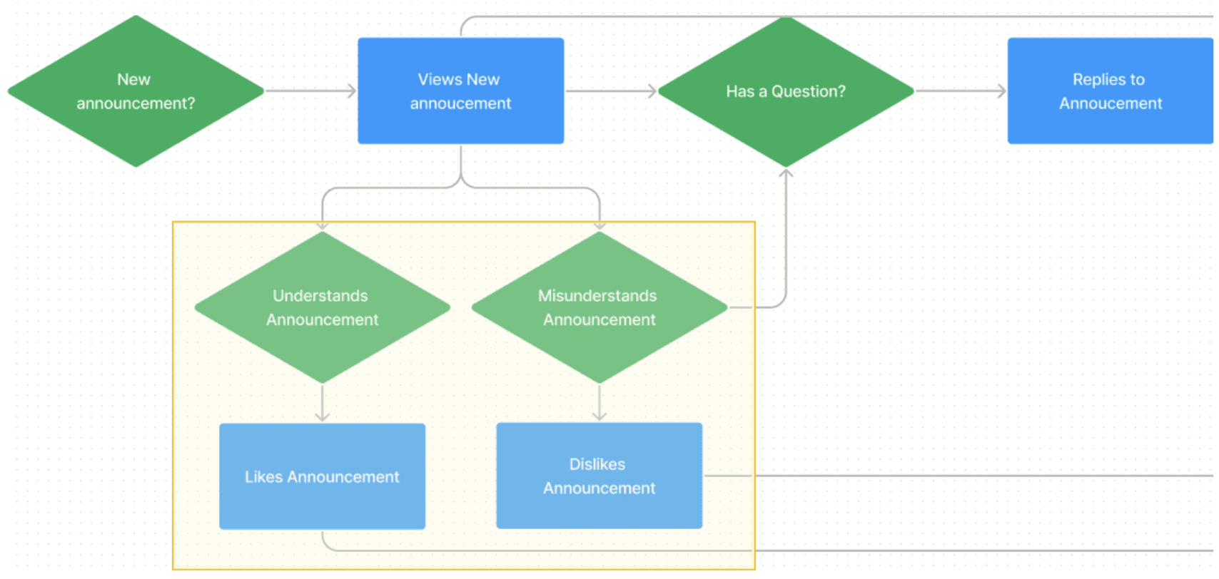
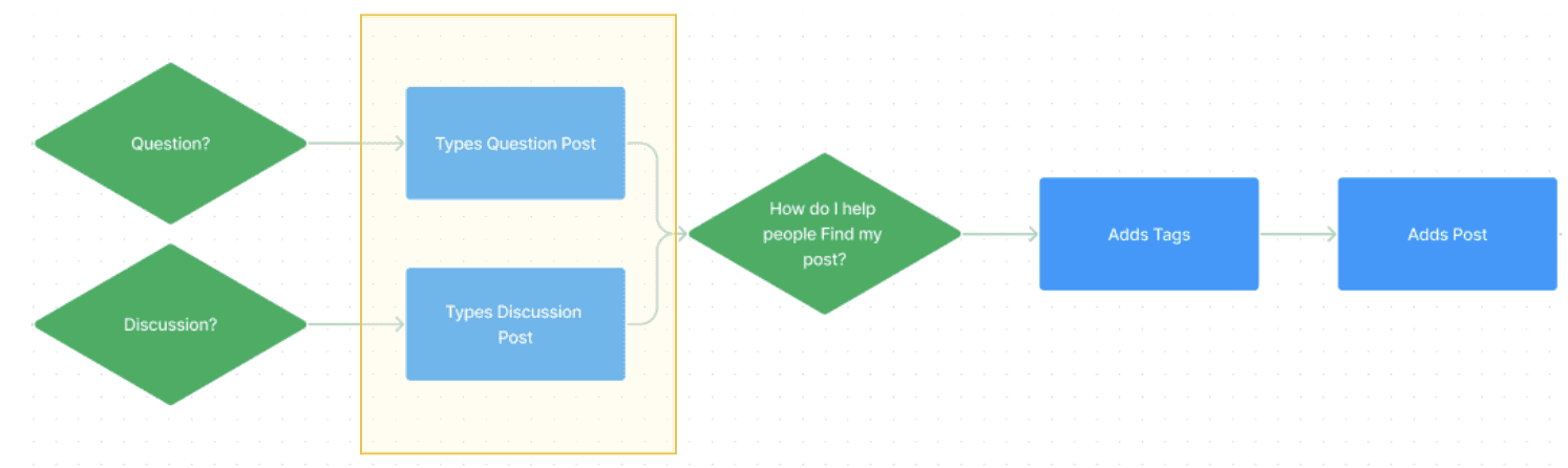
User Task Flows
The use's view when viewing a store announcement:
The user's view if a co-worker is on shift:

The user's view when posting to a discussion:
PROTOTYPING
Low-Fidelity Mockups
We designed the low-fidelity version of our app on Whimsical with an emphasis on simplicity and the overall functionality of the app. The goal in creating the lo-fis was to identify and test what features, placements, and interfaces we wanted for our platform before moving on to designing the hi-fis.


TESTING
Concept Testing
The team conducted concept testing with UX students and other participants where they interacted with the screens and answered questions that our team asked them. Participants were asked to interact with our low-fidelity screens with the sole purpose of understanding the different features or requiring an explanation for the features that have been incorporated into the six sections that will create an online community.
HIGH-FIDELITY
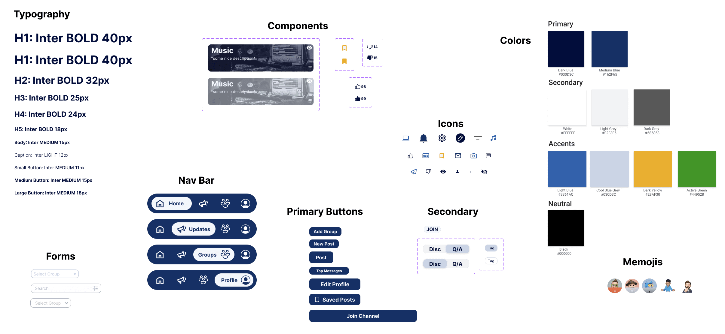
Design System
A design system was essential to organize colors, buttons, and components ensuring a consistency in the high fidelity designs. We got inspiration from the current Best Buy colors and decided to mute them to match the casual community intention.
HIGH-FIDELITY
Final Design
With the help of the design system, we were able to transform the low-fidelity prototypes seamlessly to
high-fidelity prototypes.