Cozymeal
This is a rebranding project for Cozymeal, featuring a new logo, brand assets, physical product design and a complete design & branding style guide.

Project Overview
Client: Cozymeal
Industry: Hospitality, Food Services
Timeline: 12 weeks
My Role: Solo Project
Brand Style Guide
This is a rebranding project for Cozymeal as a class project, featuring a new logo, brand assets, and style guide. The refreshed identity uses earthy greens and warm oranges to convey a professional yet inviting aesthetic, supported by redesigned stationery, social media kits, and a user-friendly website UI.

How might we differentiate Cozymeal in a saturated culinary marketplace?
The goal was to rebrand Cozymeal by creating a cohesive and modern brand identity that truly reflects the company's mission and values while differentiating it in a competitive market. This involved extensive research into the company's background and core values, identifying unique benefits and product attributes, evaluating competitors, and understanding the target audience.
The process required synthesizing these insights into a brand narrative, developing design elements, and ensuring consistency across all visual and marketing assets to create a premium, inviting, and versatile brand experience.
Visual Language: Building Warmth Through Color
The color palette consists of earthy green tones and a warm orange hue, each chosen with purpose. The deep green (#3A5F41) represents freshness, trust, and sustainability, while the minty green (#C6DAD0) adds a light, airy touch, creating balance. The warm orange (#E78A24) introduces energy, warmth, and a gourmet appeal, making the overall aesthetic both cozy and vibrant.
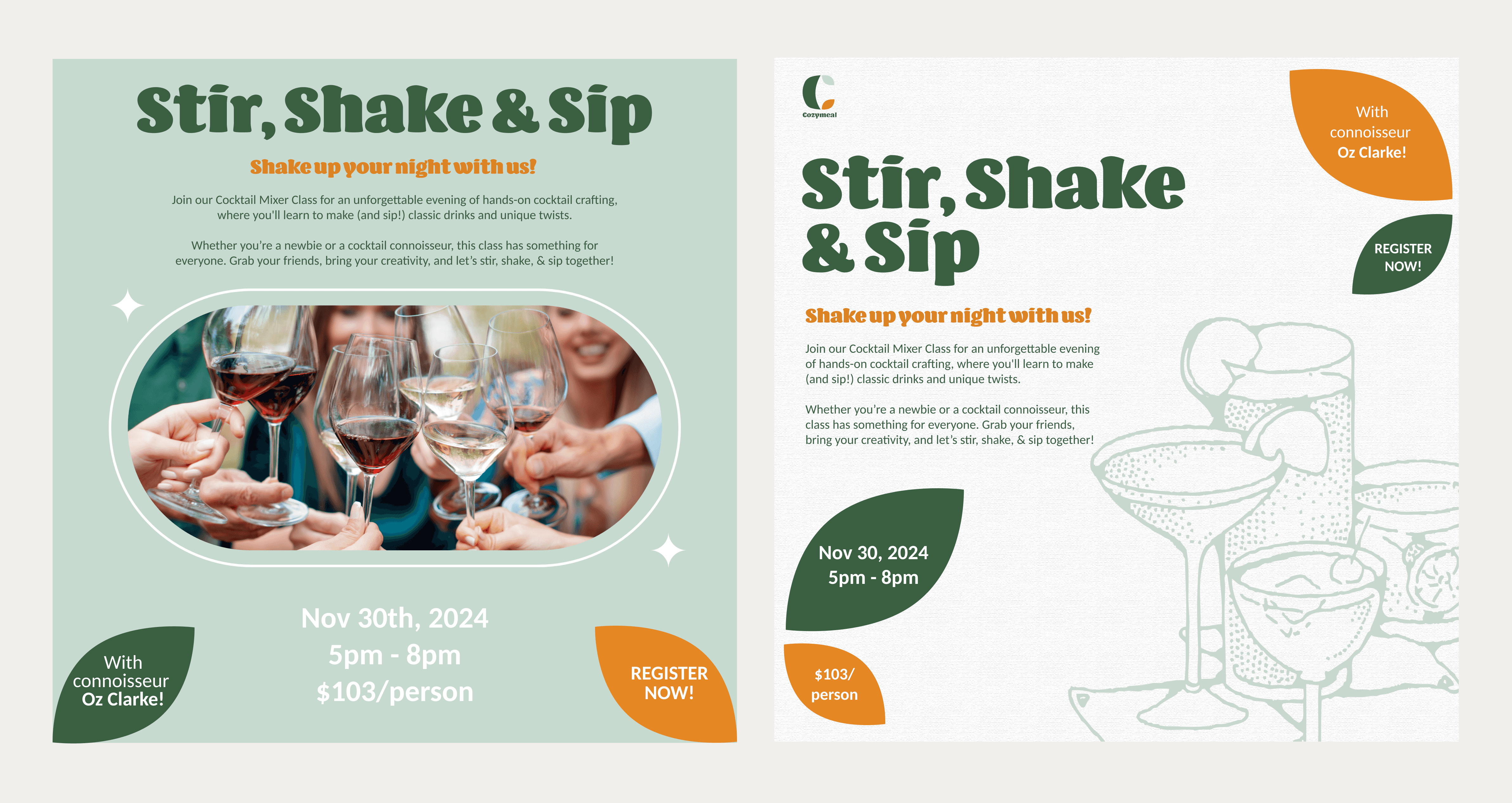
Designing for Engagement: Brand Touchpoints
Cozymeal's branding in these social media posts was designed with the goal of emphasizing a cozy, hands-on, and immersive experience for food and drink enthusiasts. The mix of real-life imagery and illustrations caters to different audience preferences while maintaining a consistent color palette and inviting tone.
Digital Experience: Translating Brand to Interface
The Cozymeal website redesign was created to enhance the user experience with a modern, clean aesthetic featuring a sophisticated dark green and neutral color palette accented by warm orange CTA buttons.
High-quality imagery highlights the immersive and social nature of the experiences, while strong visual hierarchy and intuitive navigation make it easy for users to explore.
View the prototype here